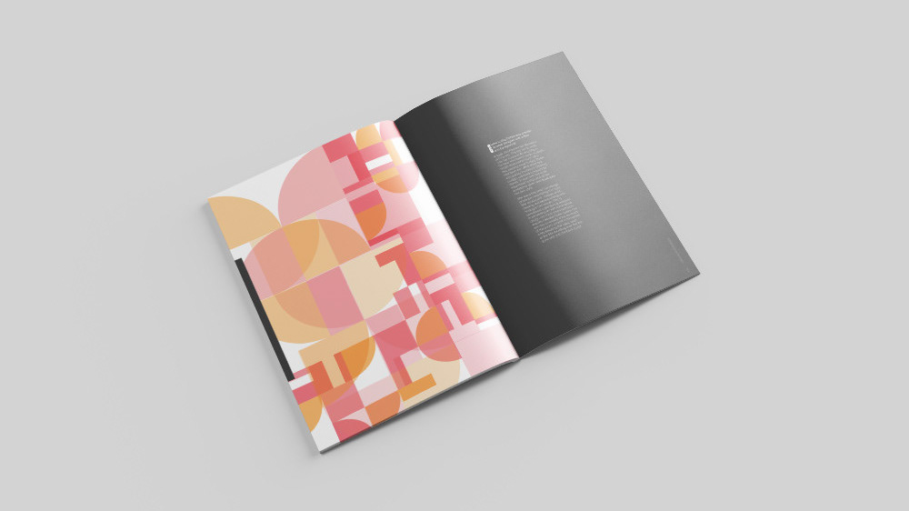
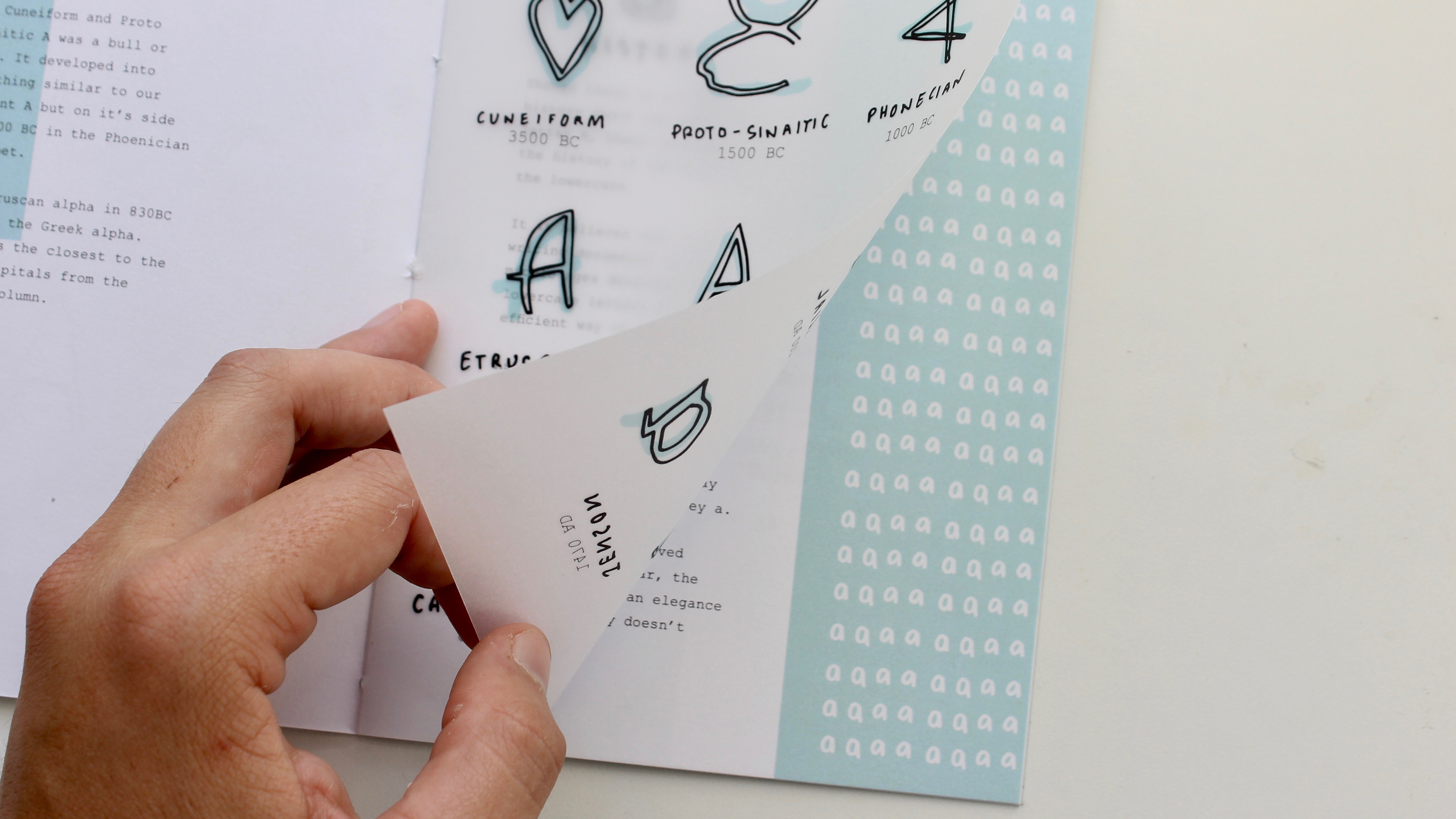
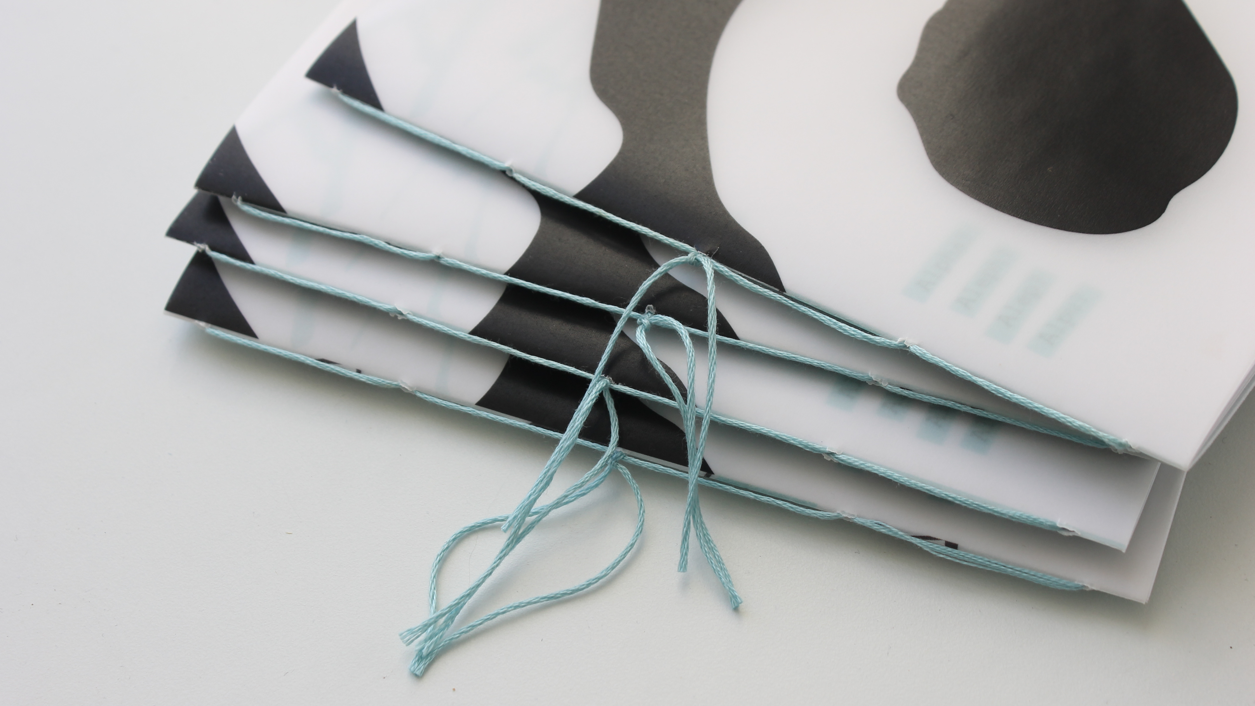
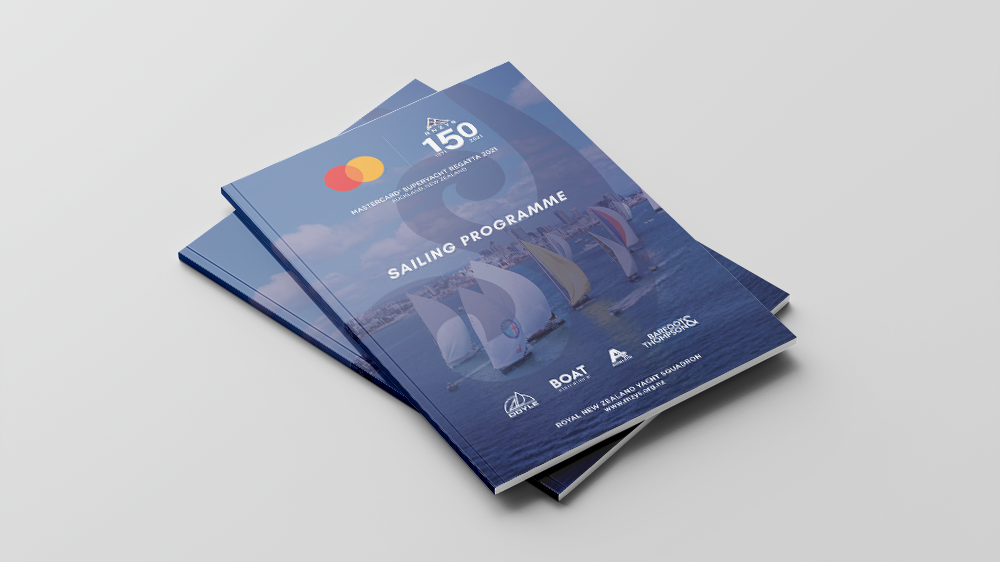
Temporal Baskerville is a variable typeface exploring the realm of temporal typography and illegibility through Baskerville – a significant typeface, known for its timeless legibility.
When first introduced in 1757, Baskerville was criticised as being illegible, the contrasting thin strokes “fatiguing to the eye”. The qualities of Baskerville’s legible letterforms can still be identified in the variable typeface until the furthest along the variable warp axis.
This idea of legibility is important for Temporal Typography. Legibility is the qualities of the letterform being recognisable but isn’t necessarily being seen as a letter.
When dealing with fluidity, legibility is continually flowing. Legibility assumes the viewer of the type is trying to read. Readability on the other hand speaks about how well type can be read, the ease of reading a body of text. This can fluctuate depending on if a typeface is being read on paper or screen, characteristics that inform legibility are still important for readability. Perception and perspective of the viewer determines how the form is seen or read. Since Temporal Baskerville has transitory elements, the perspective and perception of these forms is also fluid and changes through the time on the page.


